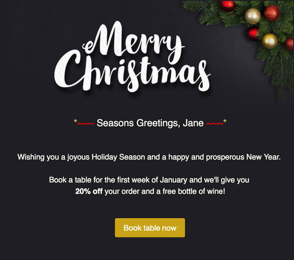
Keep it short and sweet
When sending an email you have limited time to capture your reader’s attention – generally, it’s better to have short pieces of text with a button or text link off to your website so that the reader can view more, keeping the email clean and easy to read. A popular and effective way to design email is the ‘inverted pyramid’. Grab attention with the first line, lead the reader with a little more information and then add a call to action, such as a button to your website.
Using images
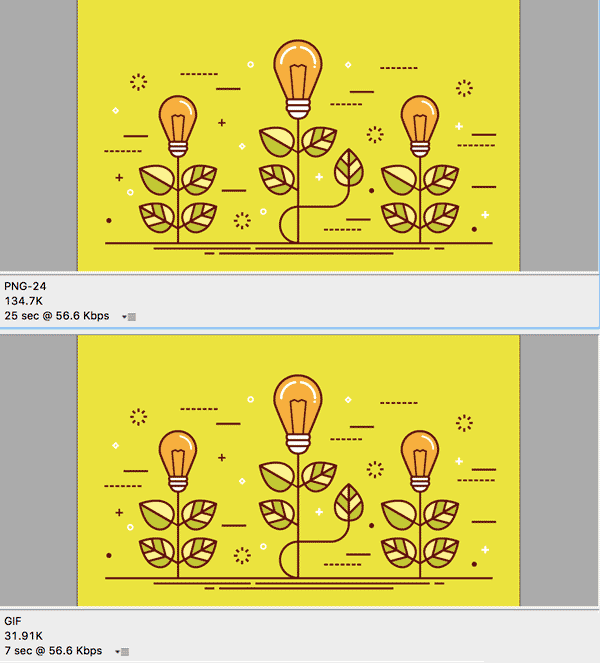
Image file formats
Choosing the right image file format plays an important role in email performance, helping keep file sizes small while ensuring images render clearly across inboxes. As a general rule, photographs should be saved as JPEGs, as they offer a good balance between quality and file size.
For non-photographic images such as logos, icons, illustrations, or text-based graphics, PNG or GIF formats are typically more suitable. PNG files support transparency and sharper edges but can result in larger file sizes, so they should be used selectively. GIF files are often smaller and widely supported in email clients, making them ideal for simple graphics or lightweight animations.
Using the most appropriate format for each image helps improve load times, deliverability, and the overall subscriber experience.
Make sure your email looks good on mobile devices
Litmus has recently collated a lot of data into the Email Market Share Report. According to the report the iPhone takes up 34% of email clients in use. This large percentage shows how important it is to make sure your emails look good on mobile devices. TalkBox allows you to preview your email on a mobile sized screen but also test your emails on real devices, if you can.
Avoid only using images
When designing your email try to have a mix of images and text and avoid using only images if possible. Some email clients do not display images automatically so using a mix of images and text can help engage a reader, even if they cannot see your images. It’s also good practice to use alt text – specify a word or a phrase in the alt text box that displays when you select an image in TalkBox. Doing this will allow the email client to show this text if a reader for some reason cannot view the image.
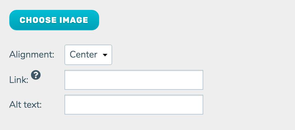
Image size
One of the biggest issues we see around images is the use of images that are far too large for email. TalkBox emails are 600px wide so a good rule of thumb is to make your images at least 650px wide. TalkBox has a handy image editor built-in – you can select your image, click the ‘Edit’ button and you’ll be able to crop it.
Typography
Whilst the use of fonts in an email is limited it doesn’t mean your type has to be boring. Mix and match typefaces to create interest. Size your headings and body copy to create a hierarchy that leads your reader through the text.
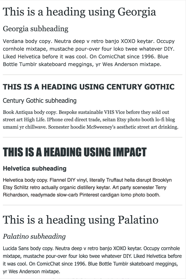
Type size
The default size for text in TalkBox is 16px. This size was chosen to make sure text in emails is easy to read on different screens. When resizing body copy text keep in mind readers using high-resolution screens and mobile devices – under 14px for body copy starts to get hard to read.
Colour
When choosing colours to use start with your logo – pick out colours in the logo and use them consistently throughout the email. If you don’t have a logo think about the kind of mood you want to convey to the reader – is it an offer for a yoga class? Blue or green might be a good choice. What about an exclusive sale that ends soon? In this case, using some red might work better.